Data Anywhere! Students Test Out App Inventor's Mobile Data Science Toolkit

May 6, 2025 robert's Blog


High school students in Mexico were among the testers of the total dissolved solids (TDS) sensor for drinking water quality. They used Bluetooth and an App Inventor app to view the data.
High school students in Mexico were among the first testers of the total dissolved solids (TDS) sensor for drinking water. They used an App Inventor app with Bluetooth to view the data.

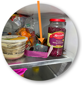
Over the last year, students have been telling unique data science stories with apps that go anywhere — the garden, ocean, water fountain, and even refrigerator. It's all part of the award-winning Mobile Data Science Toolkit in App Inventor. The components allow K-12 students to collect sensor readings and crunch data with apps that they create. For educators, it means new possibilities for teaching data science by gathering data in unconventional ways and communicating the results widely in students' apps.

Our testers gathered waterways in Cambridge, MA, so that we could compare total dissolved solids (TDS) values with those published online by the US Environmental Protection Agency.
Testers gathered samples around Cambridge, MA to compare water quality values with those published online by the US Environmental Protection Agency.

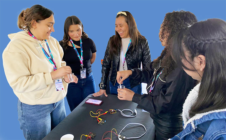
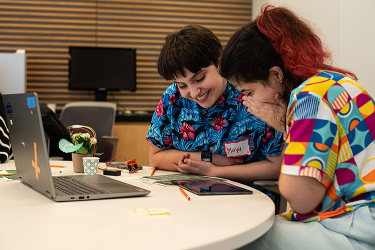
The new App Inventor components and instructional materials received a boost in 2024 when the Tools Competition, an education technology fund, chose the project for its 21st Century World Track. Then, in November of last year, an environmental curriculum using the Toolkit received the Day of Climate grant. Since then, student testers have found surprising ways to collect, clean, visualize, and analyze data on the go. They have also added App Inventor's AI Chatbot blocks to provide additional analysis and context. “I had no idea that MIT App Inventor had the capabilities of connecting with Bluetooth devices or graphing data so easily," said one Technovation Girls Boston participant, "My technovation group wasn't sure how we would finish our project in time, but I'm now feeling so much more confident.”

Using public data, students plot days of winter ice in the chart on top, and create a trendline to predict when the lake will likely experience no ice each winter.
Using public data, students created a trendline to predict when a North American lake will likely experience no ice during winter.

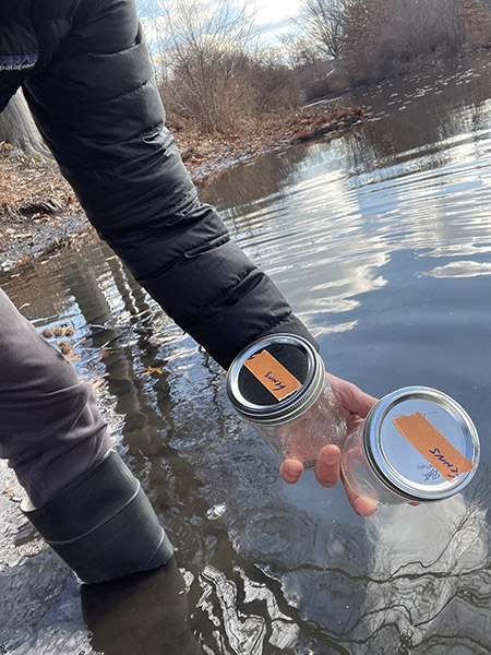
With these materials, anyone can create data science projects that address real problems they care about. The example projects, tutorials, and teacher guides are organized based on where data comes from. For sensor data, the curriculum uses Micro:bit, a popular and affordable microcontroller for education. Microbits have many onboard sensors, including temperature, light, and motion. But students have also added affordable sensors for soil moisture, pH, and total dissolved solids (TDS). Our EcoBits tutorials and teacher guide enable classrooms to gather data indoors or out.

Members of a Rhode Island chapter of Girls Who Code tested <br>soil moisture sensors and AI analysis blocks with house plants.
Members of a Rhode Island chapter of Girls Who Code tested
soil moisture sensors and AI analysis blocks with house plants.

Students can also import datasets into their apps to highlight trends about an idea or issue. Starter examples we provide include:

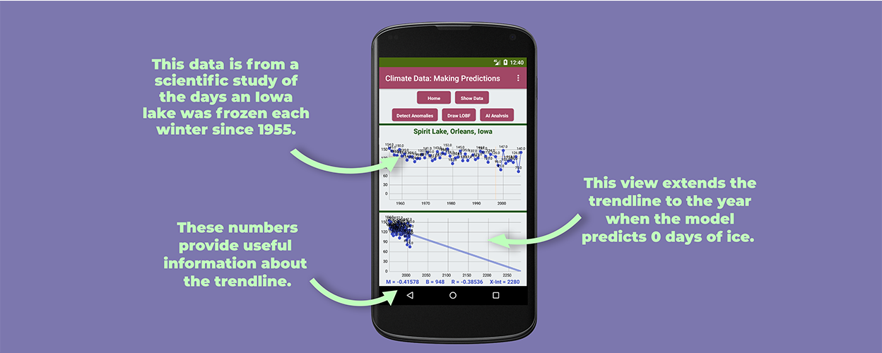
  • Historical data on lake ice coverage since 1950
  • Global CO2 released by year since 1860
  • Air transportation demand since 1990.

Students have also investigated the rise of three-point shots in basketball, pay rates by gender in the US, and tree loss in urban Massachusetts. In their apps, students can add a trendline to predict where the data might be heading. They have also used an AI chatbot to brainstorm what trends mean and what causes to investigate. Our IceMelt unit tutorials and teacher guide bring together many examples of how to import climate change datasets, analyze them, and use an app to tell the story of what they mean.

In the Fridge Project activity, students place a Bluetooth sensor in the refrigerator to see how opening the door (top graph) impacts temperature and efficiency (bottom graph).
In the Fridge Project activity, students placed a Bluetooth sensor in their refrigerators to see how opening the door (top graph) impacts temperature and efficiency (bottom graph).
MIT’s Day of Climate program was a chance to introduce students to more sophisticated environmental sensors. Two undergrads, Ava Muffoletto and Giovanna Romero Contreras, worked with App Inventor to create the “Climate Change Happens below Water” curriculum using these tools. In one curriculum unit, students in grades 5-12 collect pH data and investigate how increased acidity in the ocean harms marine animals. In another unit, students test water samples from around their communities to compare total dissolved solids (TDS) — a measure of healthy and harmful compounds in drinking water.
The image shows a phone app with EPA water quality readings and students' sensor readings, with the location of samples on a map.
This student app shows EPA water quality readings and recent sensor readings, mapping the location of each sample.
“I hope our project, Climate Change below Water, empowers students from all backgrounds to use data collection and analysis to better understand real-world issues, including complex challenges like climate change,” says Ava Muffoletto, a junior at MIT and Day of Climate grantee. “I want learners to apply these skills beyond the classroom, prompting curiosity about how they can address problems in their communities and create meaningful change.”

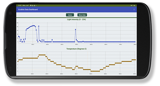
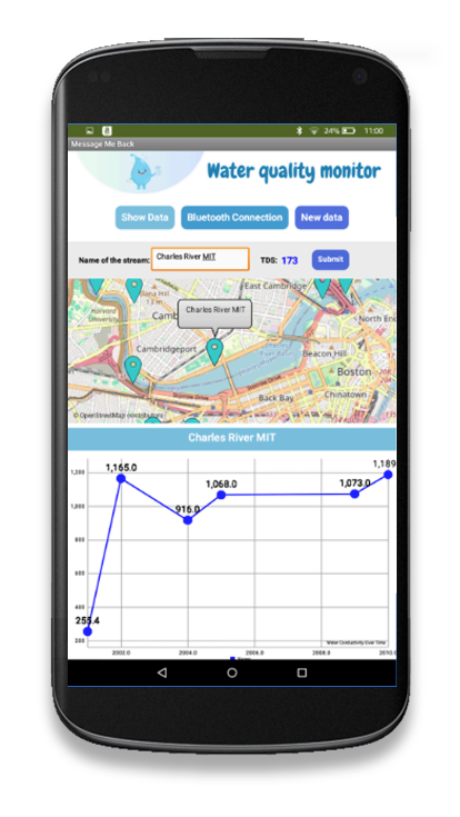
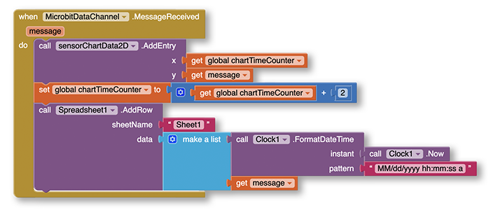
At App Inventor, we’re seeing that mobile systems (phones, iPads, and tablets) can improve student engagement around data. Students put a sensor in place and instantly see a graph on the phone — then send the data to Google Sheets via Wi-Fi or a cellular network, where anyone can watch the real-time data pour in and incorporate it into their own apps. Students can also tap public datasets to communicate issues that are important to them and their communities. Right on the phone, they can visualize data, clean it, identify trends, and use AI as a resource for interpretation.

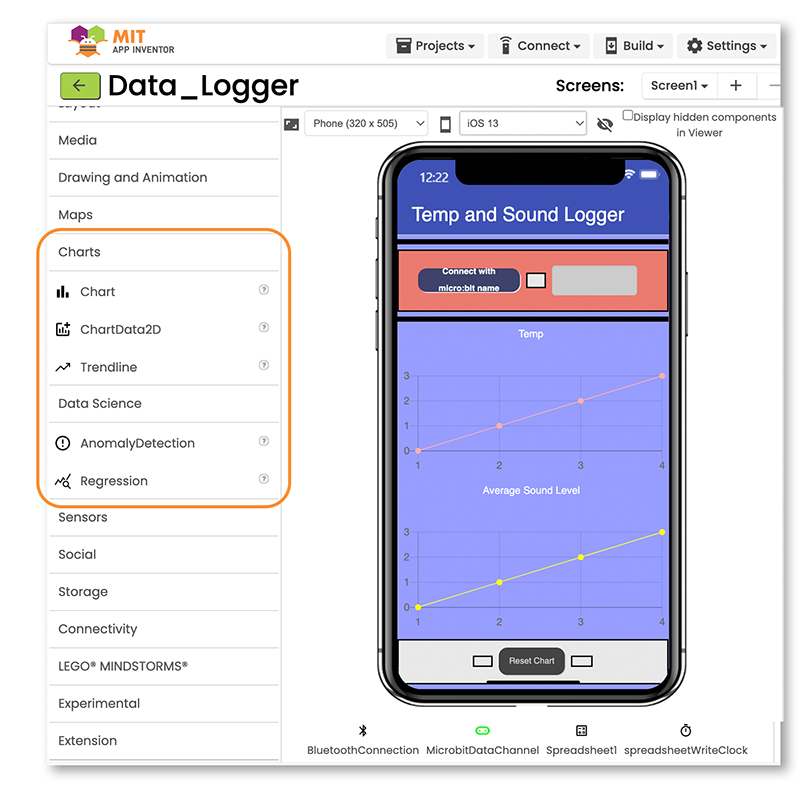
A Tour of the New Blocks in Mobile Data Science Toolkit

The image shows the Designer view of App Inventor with the new blocks in the Mobile Data Science Toolkit — Chart, Trendline, AnomalyDetection, and Regression. Other components data science students use are Spreadsheet (for Google Sheets) and BluetoothLE (to connect to Micro:bit)
The Designer view of App Inventor with the new blocks for the Mobile Data Science Toolkit — Chart, Trendline, AnomalyDetection, and Regression. Other data science components include Spreadsheet (for Google Sheets) and BluetoothLE (to connect to a Micro:bit or other device).
The image shows the Data Science blocks used to capture sensor data in an app. Above, when a data message is received by Bluetooth, the value appears in the chart and gets sent to a Google Sheets spreadsheet with a timestamp.
Several data science blocks in this code capture sensor data with an app. When a data message comes into the app by Bluetooth, the value first appears in the chart, then goes to a Google Sheets spreadsheet with a timestamp.

For students working on data science projects, mobile devices can have advantages over bulky laptops and computers:

  • Portability and Convenience. Phones are easy to carry, allowing data collection and visualization anytime and anywhere.
  • Real-Time Data Collection. Data can be collected and uploaded instantly, enabling real-time updates and immediate insights for students.
  • Wide Communication. For most people, phones are a main channel for consuming information. Mobile apps often have user-friendly interfaces, making it easier for people to understand data.
  • Integration with Device Features. Cameras, GPS, microphones, and touchscreens allow for richer data collection (for example, geotagging, photos, voice notes).
  • Improved Collaboration. Student teams can share and update data live, improving coordination and reducing duplication of effort.
  • Faster Insights with Visualizations. On-the-go visual dashboards help users quickly spot trends, anomalies, or urgent issues, supporting faster responses.