Paint Pic
This lesson has three sections: Section 1 | Section 2 | Section 3
In this lesson, you will build a Drawing app which lets you draw on the phone's screen by choosing a color and then dragging your finger around the screen. The app also lets you use the phone's camera to take a new picture and use it as the canvas for drawing.
The second part of this lesson introduces drawing dots of different sizes by tapping on the screen.
What You're Building
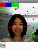
With the Paint Pic app, you can:
- Dip your finger into a virtual paint pot to draw in that color.
- Drag your finger along the screen to draw a line.
- Poke the screen to make dots.
- Use the button at the bottom to wipe the screen clean.
- Include an image as a drawing background.
What You'll Learn
After you've built the Paint Pic app, you will understand:
- Drag and Touch on the Canvas component for drawing
- Controlling screen layout with Screen Arrangement components
- Event handlers that take arguments
- Global Variables for remembering information while the app runs
- Camera component for app to access the phone's camera
Lesson Details
DESIGN: App Inventor Designer
Step 1: Start a new project Make sure your computer and your phone are set up to use App Inventor, and browse to the App Inventor Website at http://appinventor.mit.edu. Click on the orange "Invent" button and log in using a Google ID (gmail account). Start a new project in the Designer window: click My Projects and then click New. Name the new project "PaintPic". Note that App Inventor does not allow spaces in Project names. Open the Blocks Editor, click Connect to Phone, and make sure the phone has started the App Inventor app.
Step 2: Set a new screen title
There are three names in App Inventor, and it's easy to confuse them:
- The name you choose for your project as you work on it (in this case, PaintPic). This will also be the name of the application if you package it for the phone.
- The name "Screen1", which is the name of the Screen component. You'll see it listed in the Components panel in the Designer. You can't change the name of the Screen component in the current version of App Inventor, but you can change its Title property.
- The Title property of the screen, which is what you'll see in the phone's title bar. The Title starts out being "Screen1" but you can change it if you want. You may want to rename the title of the screen to PaintPic now (select Screen1 in the list of components, and then look on the right side Properties panel for the Title property). To reiterate, the name and the title of Screen1 are initially the same, but you can change the title if you want.
Step 3: Make three buttons On the left column of the Designer, open the Basic palette, and first drag three Buttons over to the Viewer
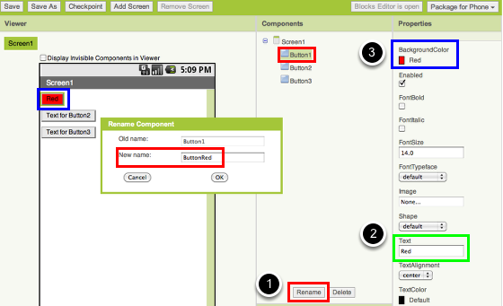
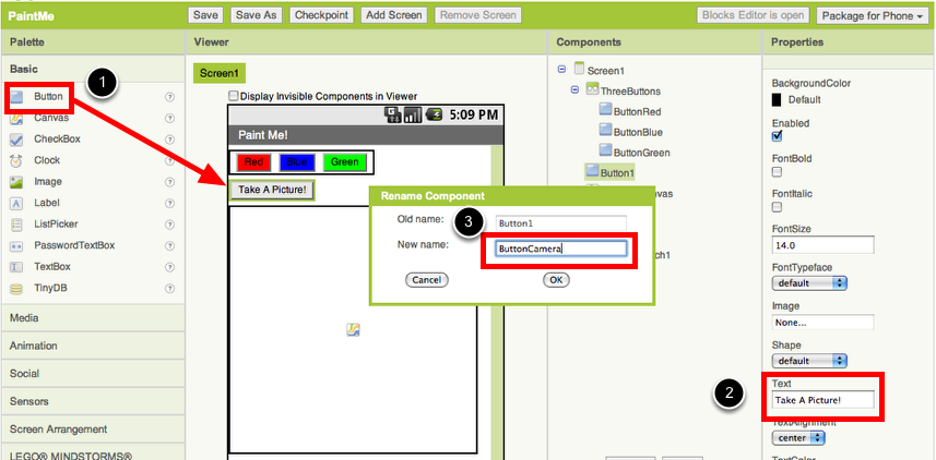
Step 4: Color code and rename the buttons Click on Button1 component in the Components pane in the Viewer to highlight it (it might already be highlighted) and use the Rename button to change its name from "Button1" to "ButtonRed" (#1).
Change the button's Text attribute to "Red" at the Properties pane (#2) and make its BackgroundColor "red" (#3).
Similarly, make two more buttons (Button2 and Button3) for blue and green. Name them "ButtonBlue" and "ButtonGreen", placing them vertically under the red button.
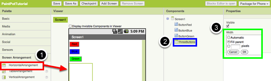
Step 5: Add a horizontal arrangement container From the Palette pane, click the Screen Arrangement palette and drag out a HorizontalArrangement component and place it under the buttons in the Viewer (#1). Change the name of this component from "HorizontalArrangement1" to "ThreeButtons" (#2). In the Properties pane, change the width of the ThreeButtons to Fill Parent so that it fills the entire width of the screen (#3).
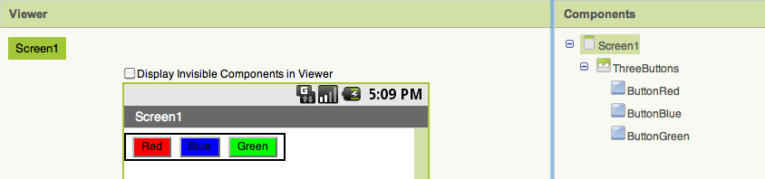
Step 6: Arrange three buttons horizontally Drag the red button inside of the ThreeButtons component. Then drag the blue button right next to the red button, and do the same for the green button. In the Components pane, you'll see the three buttons indented under the ThreeButtons to show that they are now its subcomponents.
Step 7: Add a Canvas From the Basic palette, drag a Canvas component onto the Viewer. Change its name to "DrawingCanvas," and set its Width to "Fill Parent." Set its Height to 300 pixels.
Step 8: Add a camera component From the Media palette, drag a Camera component onto the Viewer. Notice that it drops down into the invisible components area at the bottom of the screen.
Step 9: Add a button to activate the camera From the Basic palette, drag the Button component and drop it right below the horizontal arrangement (#1). Change its text property to "Take A Picture!" (#2) and rename the button to "CameraButton" (#3).
Step 10: Add a Wipe button and arrange it horizontally with the Camera button From the Basic palette, drag another Button component and place it under the ButtonCamera, which you just created. Change its name to "ButtonWipe", as well as its Text attribute to "Wipe". From the Screen Arrangement palette, drag out a HorizontalArrangement component and place it right under the ThreeButtons component (the first horizontal arrangement) buttons in the Viewer. Bring the ButtonCamera and the ButtonWipe inside of this Horizontal Arrangement side by side, just like you did for the three buttons in Step 5.
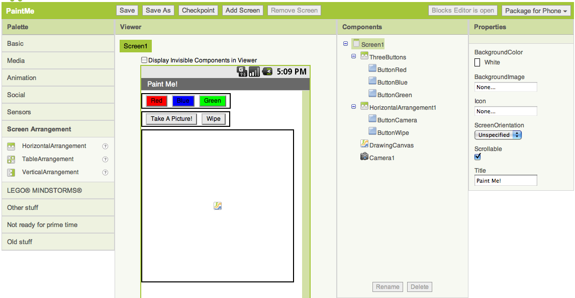
This is what your Designer should look like:
Ready to go on? >>Go to Next Section>>
MIT App Inventor

 © 2012-2025 Massachusetts Institute of Technology

This work is licensed under a Creative Commons Attribution-ShareAlike 4.0 International License.
Terms of Service and Privacy Policy
Other inquiries: Email
GitHub: mit-cml
Accessibility: accessibility.mit.edu