PaintPot (Part 1)
This tutorial has two parts: Part 1 | Part 2
This tutorial introduces the Canvas component for creating simple two-dimensional graphics. You'll build an app that lets you draw on the phone screen in different colors.
Historical note: PaintPot was one of the first programs developed to demonstrate the potential of personal computers, as far back as the 1970s.
Download Book Chapter PDF
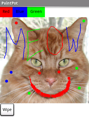
With the PaintPot app, you can:
- Dip your finger into a virtual paint pot to draw in that color.
- Drag your finger along the screen to draw a line.
- Tap the screen to make dots.
- Use the button at the bottom to wipe the screen clean.
- Include an image as a drawing background.
This tutorial assumes that you have completed the HelloPurr tutorial. This tutorial introduces the following App Inventor concepts:
- The Canvas component for drawing.
- Controlling screen layout with Arrangement components.
- Event handlers that take arguments.
- Variables.
Before starting
Make sure your computer and your mobile device are set up to use App Inventor. Open App Inventor in a browser window, start a new project, and name it "PaintPot".
Screen title
To get started, go to the Properties panel on the right of the Designer window and change the screen Title to "PaintPot". If you connect to the Companion on a mobile device, you should see this change on the device, with the new title showing in the title bar.
There are three names in App Inventor, and it's easy to confuse them:
- The name you choose for your project as you work on it (in this case, PaintPot). This will also be the name of the application if you package it for the phone.
- The name "Screen1", which is the name of the Screen component. You'll see it listed in the Components panel in the Designer. You can't change the name of the first Screen component in the current version of App Inventor but you can create additional screens with names of anything you should choose.
- The Title property of the screen, which is what you'll see in the mobile device's title bar. Title is a property of the Screen component. The Title starts out being "Screen1", which is what you used in HelloPurr. However, you can change it, as you're doing for PaintPot. To reiterate, the name and the title of Screen1 are initially the same, but you can change the title if you want.
Set up the Components
You'll use these components to make PaintPot:
- Three Buttons for selecting red, blue, or green paint, and another button for clearing the drawing.
- A Canvas, the drawing surface. This canvas has a BackgroundImage, which is this kitty from the HelloPurr tutorial. You can also draw on a blank canvas. That's just a canvas without a background image.
- There's also a component you don't see: you use a HorizontalArrangement to make the three color buttons line up side by side.
That makes five components in all. Let's get them and build the app.
Color Buttons
- Drag a Button component onto the Viewer and change the Button's Text attribute to "Red" and make its BackgroundColor red.
- Click on Button1 in the Components list in the Viewer to highlight it (it might already be highlighted) and use the Rename... button to change its name from "Button1" to "ButtonRed".
- Similarly, make two more buttons for blue and green, named "ButtonBlue" and "ButtonGreen", placing them vertically under the red button.
Here's how this should look in the Designer, with the button names appearing in the list of project components. In this project, you're changing the names of the components rather than leaving them as the default names as you did with HelloPurr. Using meaningful names makes your projects more readable to yourself and others.
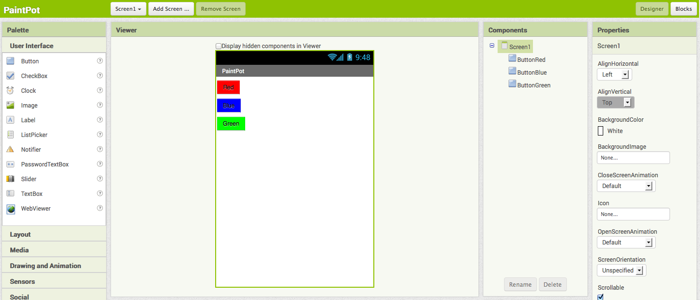
Connect to the AI2 Companion using the "Connect" menu. You should also see the three buttons on the mobile device screen.
Layout with Screen Arrangement
You should now have three buttons, one below the other. The next step is to make them line up horizontally. You do this using a HorizontalArrangement component.
- From the Palette's Layout drawer, drag out a HorizontalArrangement component and place it under the buttons. Change the name of this component from "HorizontalArrangement1" to "ThreeButtons".
- In the Properties panel, change the Width of ThreeButtons to "Fill Parent..." so that it fills the entire width of the screen.
- Drag the three buttons side by side into the HorizontalArrangement component. Hint: You'll see a blue vertical line that shows where the piece you're dragging will go.
If you look in the list of project components, you'll see the three buttons indented under the ThreeButtons to show that they are now its subcomponents. Notice that all the components are indented under Screen1.
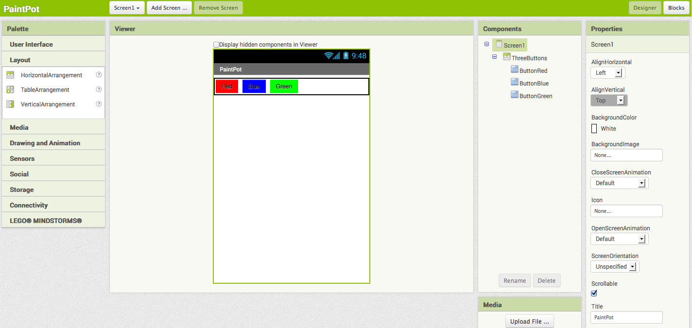
You should also see your three buttons line up in a row on the screen of your mobile device, although things might not look exactly as in the Designer. For example, the Arrangement's outline shows in the Designer but not on the device.
In general, you use Layout Arrangements to create simple vertical or horizontal layouts. You can create more complex layouts by nesting Screen Arrangement components. There is also a TableArrangement component (not covered in this tutorial).
Canvas and Wipe Button
The final two components are the Canvas and the Wipe Button.
- From the Palette's Drawing and Animation drawer, drag a Canvas component onto the Viewer. Change its name to "DrawingCanvas". Set its Width to "Fill Parent" and set its Height to 300 pixels.
- Add a Background Image to the Canvas. Click on the field containing "None..." next to BackgroundImage in the Canvas's Properties panel. You can use the same kitty.png file, from the HelloPurr tutorial, or you can use another image of your choosing.
You can use any image you like, but you'll get the best results if the size of the image (in pixels) is close to the size at which you'll be showing it on the device. Also, large images will take a long time to load, and might exceed the memory capacity of the device allocates for applications. - From the Palette, drag the final Button onto the screen, placing it under the Canvas. Rename this Button component to "ButtonWipe" and change its Text property to "Wipe".
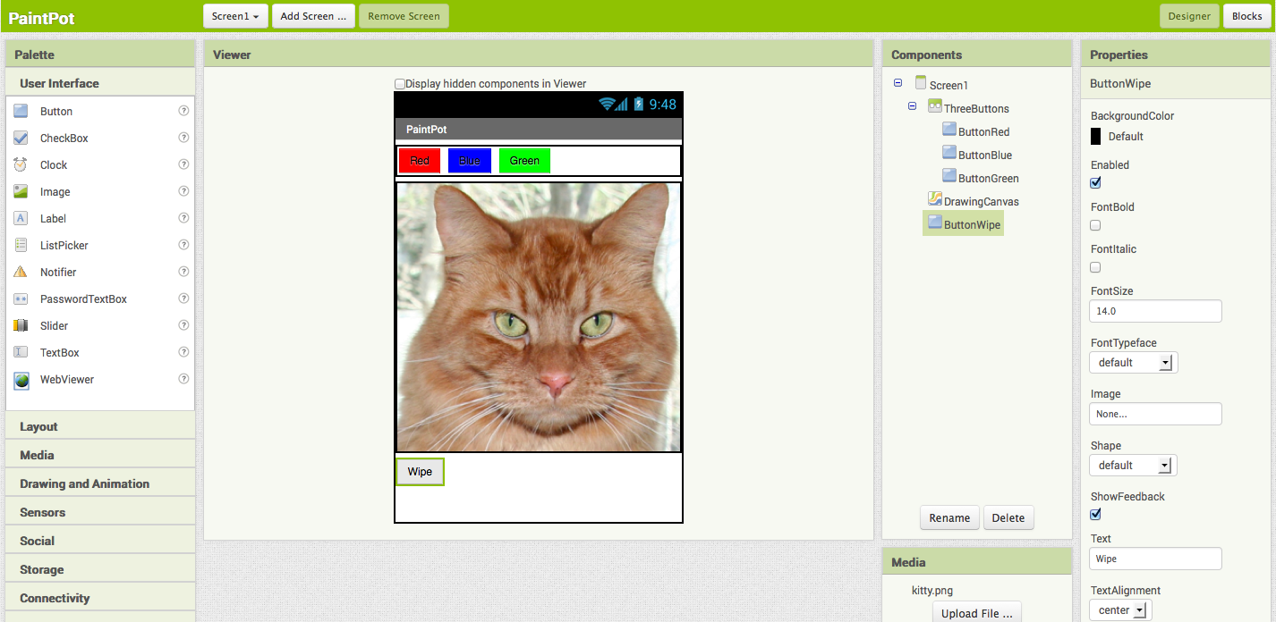
You've now completed the steps to set the appearance of your app. Here's how this should look in the Designer. Next, you'll define how the components behave.
Add Behaviors to the Components
Click the Blocks button to switch to the Blocks Editor. First you will code the buttons that change the paint color. Later you will add blocks to code what happens when someone touches or drags the screen.
Add Button Event Handlers
In the Blocks Editor:
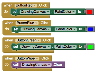
- Open the drawer for ButtonRed and drag out the when ButtonRed.Click block.
- Open the DrawingCanvas drawer. Drag out the set DrawingCanvas.PaintColor to block (remember that the set block of components is a dropdown so PaintColor is a selection in the dropdown) and place it in the do section of when ButtonRed.Click.
- Open the Colors drawer and drag out the block for the color Red and snap it to set DrawingCanvas.PaintColor to. (Clicking on a color block after it's been placed will display a table of colors that you can select from.)
- Repeat steps 2-4 for the blue and green buttons.
- The final button to set up is the Wipe button. Make a click event handler for ButtonWipe by dragging when ButtonWipe.Click from the ButtonWipe drawer. From the DrawingCanvas drawer, drag call DrawingCanvas.Clear and place it in the do area of the when ButtonWipe.Click block.
The blocks for the buttons should look like this:
Add Touch-event Handlers
Now for the next step: drawing on the Canvas. You'll add blocks so that when you touch the canvas, you get a dot at the spot where you touch. If you drag your finger slowly along the canvas, it draws a line.
- In the Blocks Editor, open the drawer for the canvas and drag the when DrawingCanvas.Touched block to the workspace. As soon as you drag the block out, you may notice three argument names (highlighted in orange) located at the top of the block x, y, and touchedSprite. These arguments are also known as local variables and can get accessed by using the get or set blocks found in the Variables drawer and then selecting the proper variable in the drop down menu. You can also access these variables by moving your cursor over to the highlighted name and selecting the variable you would like to use.
You've already seen button click events. Clicks are simple, because there's nothing to know about the click other than that it happened. Other event handlers such as when ... Touched need information about the event. In App Inventor, this information is expressed as the value of arguments associated with the event handler. For the when ... Touched event, the first two arguments stand for the x and y coordinates of where the touch happened. We'll save touchedSprite for a later tutorial.
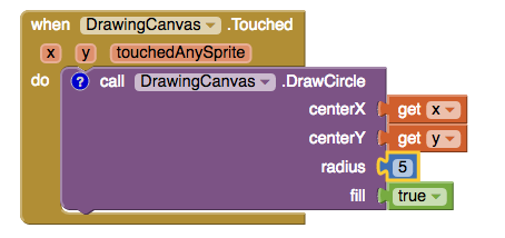
- For this touch event, make the Canvas draw a small circle at the point with coordinates (x, y). Drag out a call DrawingCanvas.DrawCircle block from the Canvas drawer and place it in the do section of when DrawingCanvas.Touched.
On the right side of the call DrawingCanvas.DrawCircle block are four sockets where you must specify values for the x and y coordinates where the circle should be drawn, radius, which is the radius of the circle, and fill, which is true to draw a filled circle, or false to draw an outlined circle. For x and y, you'll use the values of the arguments that were supplied to the Touched handler:
- Move your cursor over the x variable (highlighted in orange). Find the get x block and drag it into the corresponding x socket in the when DrawingCanvas.Touched block.
- Do the same for the y variable.
- You'll also need to specify the radius of the circle to draw. Five (pixels) is a good value for this app. Click in a blank area of the screen and type the number 5 followed by return to create a number block with a value of 5. Typing on the blank area of the screen is called typeblocking and is a useful shortcut to know. This can be done for any block, not just numbers. Plug the block for 5 into the radius slot. Click on the following links for more information on arguments and typeblocking.
- Drag out a true block from the Logic drawer and plug it into the fill slot. This ensures the dots drawn will be filled in.
Here's how the touch event handler should look:
Try testing out what you have so far on the device. Touch a color button. Now touch the canvas, and your finger should leave a dot at each place you touch. Touching the Wipe button should clear your drawing.
Add Drag Events
Finally, add the drag event handler. Here's the difference between a touch and a drag:
- A touch is when you place your finger on the canvas and lift it without moving it.
- A drag is when you place your finger on the canvas and move your finger while keeping it in contact.
When you drag your finger across the screen, it appears to draw a giant, curved line where you moved your finger. What you're actually doing is drawing hundreds of tiny straight lines: each time you move your finger, even a little bit, you extend the line from your finger's immediate last position to its new position.
A drag event comes with 6 arguments. These are three pairs of x and y coordinates that show:
- The position of your finger back where the drag started.
- The current position of your finger.
- The immediately previous position of your finger.
There's also a sprite, which we'll ignore for this tutorial.
Now make the app draw a line between the previous position and the current position by creating a drag handler:
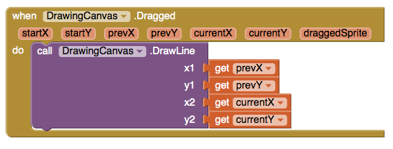
- From the DrawingCanvas drawer, drag the when DrawingCanvas.Dragged block to the workspace.
- Also from the DrawingCanvas drawer, drag the call DrawingCanvas.DrawLine block into the do slot of the when DrawingCanvas.Dragged block.
- Drag a get prevX block to the open x1 slot in when DrawingCanvas.DrawLine. Do the same for the other spaces: y1 should be get prevY, x2 should be get currentX, and y2 should be get currentY.
Here's the result:
Test your work by trying it on the device: drag your finger around on the screen to draw lines and curves. Touch the screen to make spots. Use the Wipe button to clear the screen.
In PaintPot Part 2, you'll see how to use global variables to create dots of different sizes.
Review
Here are some of the ideas covered in this tutorial:
- You can use Layout Arrangement components to specify screen layouts other than just placing components one under the other.
- The Canvas component lets you draw on it. It can also sense touches and drags.
- Some event handlers are called with information about the event, such as the coordinates of where the screen was touched. This information is represented by arguments. When you select an event handler that has arguments, App Inventor creates argument blocks for these.
Scan the Sample App to your Device
Scan the following QR code onto your device to install and run the sample app.

Download Source Code
If you'd like to work with this sample in App Inventor, download the source code to your computer, then open App Inventor, click Projects, choose Import project (.aia) from my computer..., and select the source code you just downloaded.
MIT App Inventor

 © 2012-2025 Massachusetts Institute of Technology

This work is licensed under a Creative Commons Attribution-ShareAlike 4.0 International License.
Terms of Service and Privacy Policy
Other inquiries: Email
GitHub: mit-cml
Accessibility: accessibility.mit.edu