Color Blocks
Color Blocks
The Blocks Editor Colors drawer contains several blocks corresponding to commonly used colors. You can plug these into the sockets for blocks that require colors, such as setting the text color or the background color of a component. These same colors can also be selected from the color dropdown lists in the Designer's Properties panel.
Using Predefined Colors
Predefined colors are listed in the Colors drawer.

Making your own colors
Colors in App Inventor are encoded as numbers, as you can see if you print a color block. For example, the color blue is the large negative number ?16776961. If you know the secret to encoding colors, you don't need to be restricted to App Inventor's built-in colors. You can put any color at all into your apps.
Colors are created using four numbers, each running from 0 through 255. The first three numbers signify the amount of red, green, and blue in the color. You can find color charts on the Web that give the R , G , B specifications for many colors, or you can experiment with your own R , G , B mixtures. The fourth number specifies opacity which comes into play when regions overlap. Opacity 255 is fully opaque: the color will completely block out anything under it. Opacity 0 is fully transparent: you won't even see the color on the screen. Intermediate values determine how much the underlying screen will show though.
A "make color" block will take a list of your R , G , B and opacity components and create that color for you. The opacity component is optional, if omitted is set to 255. A "split color" block takes a color and returns a list of the four number components.
This chart gives the numbers for a variety of colors.
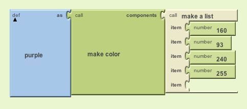
Here's a sample program that assigns the name purple to the color with R=160, G=32, B= 240, and opacity = 255.

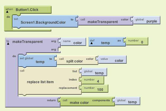
Using the "split color" block, the user can manipulate the R, G, B and opacity values separately. Heres an example program using split color. The procedure takes in a color and then returns a new color with the opacity at 100.


